The Creative
Concept
A creative studio doing international-caliber work, with a website that didn't show it. We built an immersive, scroll-driven experience where motion carries the narrative. Leads now arrive qualified, not confused.
The brief
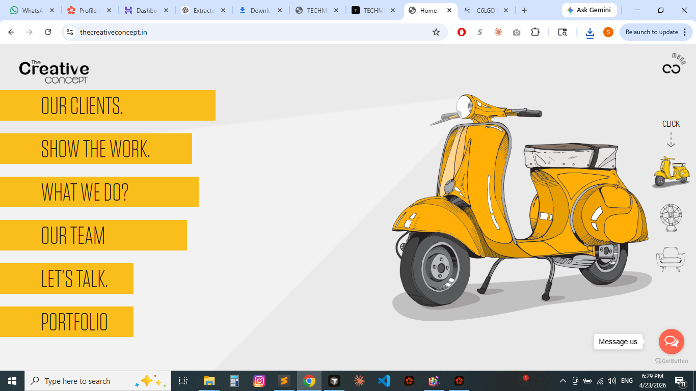
The Creative Concept is a full-service creative studio producing brand identities, campaigns, and experiences for clients across the globe. Their portfolio was exceptional, but their website was a static, low-energy grid that communicated nothing about the studio's energy or craft. Prospective clients couldn't feel the work before they read it.
The brief: replace the existing presence with an immersive experience that signals the caliber of the work before a visitor reads a single case study. Scope covered positioning audit, art direction, motion design in the browser, performance-aware animation, and a build that ships without compromising experience on real devices.
THE PROBLEM
BEFORE US
A creative studio competing globally, with a site that told visitors nothing about the energy behind the work. The experience had to feel international-caliber before anyone read a word.
Static layouts communicated nothing about the studio's motion and interaction capabilities, the very craft they sell. Visitors left before understanding what set the studio apart.
Navigation was service-first, not story-first, sending leads directly to a contact form without context or desire-building.
There was no hierarchy that built desire before asking for commitment; the site treated all visitors as already-decided buyers.
Motion with intent, not motion for the sake of it
The hardest constraint: every animation had to earn its place. Motion that distracts is worse than no motion at all. We designed the scroll narrative first, then chose the technical implementation, not the other way around.
Positioning Audit
We audited how the studio was perceived vs. how it wanted to be perceived. Gap analysis between the work in their portfolio and the story being told online. This defined the emotional register we needed to hit: confident, technical, with an edge that generic agencies lack.
Scroll Narrative Design
We storyboarded the scroll experience before writing a line of code. Each section was assigned a job in the narrative (brand introduction, capability proof, social proof, call to action) and we worked out the pacing and staging to make the journey feel intentional, not accidental.
Motion Design & Animation System
We designed an animation library with restraint as the first rule: every transition had to be faster than you expect and smoother than you've seen from comparable studios. We used GSAP + ScrollTrigger for precise, frame-accurate control, not CSS-only animation where timing matters.
Performance-Aware Build
A visually heavy site can become a liability on slower connections. We enforced a strict performance budget: animations defer until after first contentful paint, assets are lazy-loaded and optimized, and motion reduces gracefully for users with `prefers-reduced-motion` active. Beautiful on the best device, functional on the worst.
Maintainable Architecture & Launch
We built for the team's independence: a documented component system so they can add case studies, update services, and evolve the site without touching the animation layer. The build is a clean, modular structure, not a fragile tangle that needs an agency retainer to change a paragraph.
WHAT WE
DELIVERED
An immersive, scroll-driven experience where every transition supports the positioning. Built to feel international-caliber the moment the page loads, and to stay that way as the team grows it.
Positioning & Narrative
- Brand positioning audit
- Scroll narrative storyboard
- Copy architecture & hierarchy
- International-caliber tone of voice
Motion & Interaction
- Custom GSAP animation system
- ScrollTrigger scroll narrative
- Entrance, exit, & transition library
- Reduced-motion accessibility layer
Design System
- Editorial-scale typography
- Dark/light section rhythm
- Portfolio grid with hover states
- Component tokens & design system
Engineering
- Performance-first custom build
- Deferred animation loading
- Optimized asset pipeline
- Modular, maintainable architecture
WE DESIGNED FOR THE MOMENT
BEFORE THE FIRST SCROLL.
Most studios treat the hero as a header. We treated it as an audition. The first 3 seconds of this site had to communicate: "this team operates at a different level." We used a full-viewport typographic statement and a restrained, precisely timed entrance animation to signal confidence before any work was shown.
The result: visitors who made it past the hero were pre-qualified; they'd already decided the studio was worth their time. That changed the quality of every conversation that followed.
Positioning, measured by what changed
The Creative Concept's site is now a first filter, not just a business card. It pre-qualifies visitors so the team spends less time educating and more time closing.
WHY THE CREATIVE
CONCEPT CHOSE US
They needed a partner who understood the brief at a technical and strategic level simultaneously.
Other studios could build immersive, but at the cost of load times. We had a track record of delivering both. That wasn't a compromise they were willing to make on their flagship presence.
Every visual decision needed a business rationale. We don't style things because they look good; we design them because they serve a conversion goal. That discipline mattered when defending choices to stakeholders.
We understood the brief instinctively because we operate in the same space. We know what a creative studio needs to communicate and what "international-caliber" actually means in practice.
We had a functional site before. Now we have a sales system. The difference is measurable: leads come in qualified, not confused. Every conversation starts from a better place.
"Techmines understood our vision immediately. They built something that represents us in a way we couldn't articulate ourselves, and the site has been our single best new business tool since launch."
Google Review · The Creative Concept